Wednesday, December 15, 2010
Poster Project
The FINAL project of the semester was to create a poster a tour poster for our favorite band. I chose Paramore and instantly had an idea of how I wanted it to look. Unfortunately, my ideas were all being done in Illustrator and this project was supposed to be done in Photoshop. I have not had much experience with Photoshop at all and was so worried about how to translate my idea to the computer. Thankfully, it wasn't as difficult as I thought. The challenge was that in picking an album for to represent but with out using their album artwork or any photos of the artists themselves. I think that this was my favorite project overall because I had free reign of the layout and design and complete concept how what I wanted this poster to be.
I chose Paramore's sophomore album, Riot! I love this cd and the idea of doing something alot more risque compared to my previous work. I was completely stuck on how to create a montage or college and just began layering photos all over the page until I found the photo of the smoke in the sky. After finding this photo, the concept seemed to fall in place. It is very dark and bold, but my favorite part of the poster is the group of exclamation points who represent protesters and on their picket signs are a few of the most popular songs from the album. I thought that with the poster being so serious, it gave a nice moment of quarkiness, which is certainly part of the band's persona. I like the two guys sort of going up against each other with an actual riot scene. Overall, I am very proud of the final product!
Final Calendar Project
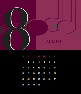
So I did not stray to far from my first idea. I thought the cover was very elegant but fun and really enjoyed the brush on the treble clef symbol. As for the rest of the calendar, I really wanted to incorporate the number of beats for each numeral. I tried using two colors and fell in love with the two-tone look. It also gave me a way to differentiate the half note,the lighter notes, from the quarter notes. After taking type 1 and type 2, I realized that I like to keep things simple. I want my work to breath and it makes it difficult when you want to show depth in a project but I think the simplicity of this calendar is very nice and fun for anyone who enjoys music. I've been working really hard to move away from more corporate styles and I think that I definitely did here!
Subscribe to:
Comments (Atom)


